
This fall a client contacted me to create a custom set of five paintings especially for her. Per usual, I was up for the challenge and super excited!
When she first got in touch she let me know that she’d been looking for a certain style of artwork for a while with no luck, and started to search online. She found my website (thank you internet!), liked the range of styles in my Custom Artwork portfolio, and emailed me. She also sent some pictures of the walls in her living room and measurements so I could suggest sizing options & quote:

pictures of the two walls that she would like art for
After playing around with different sizes and layout ideas, like a long narrow piece for either wall, or a tall triptych on each, etc… we decided on a set of five 24”x18” pieces.
Style wise she sent me a picture of a pattern she was drawn to, as well as her toss cushion fabrics so I could see what style/colour scheme we were working with:

left – pattern/style that she liked, right – her toss cushion fabrics
From these pictures I started sketching ideas to show her of a complimentary style with some Moroccan inspired patterns added in throughout:

sketches I did of different patterns / layout possibilities
Happy with the style I proposed, she selected five sketches that she liked best and we were well on our way! What’s next? Colour planning! She wanted this set to be really bright and contemporary, including the blue and green accents she already had established in the room, but also wanted to add in oranges and hints of red/yellow/brown/purple.
So keeping in mind that three paintings were going on a dark wall and two were going on a shorter light wall, I planned to do three paintings with a cream background and two with a coloured background (she selected green for these two) so they’d all really pop on the walls:

colour mock ups of the five selected designs
Having just got a new iMac this summer, and being the total planning nerd that I am haha, I mocked up the sketches on the computer to decide which colour I liked where in the designs. So once the colour mock ups were approved by my client, I was ready to start painting up a storm!

view from my bench, looking up at reference material including toss cushion fabric for colour matching
Painting technique wise, we could have gone with a crisp contemporary almost printmaker look (kind of like the colour blocking of the colour mock ups – flat, clean, and crisp), instead we decided on a more layered and patina style look, which was much warmer visually although still contemporary over all.

left – progress shot, middle & right – detail shots of texture / distressed patina look
For the edge colour I wanted to go with something that wouldn’t distract away from the brightness of the paintings themselves, but would also coordinate with her décor. Answer? Espresso.

left – espresso edge colour shown on 3″ deep canvas frame, middle – painting #’s 2-5 drying, right – espresso sides of each painting with subtle signature on bottom edge of each
Oh – the name! I was drawn to words like eclectic, geometric, kaleidoscopic (because it means multi-coloured lol), but they just weren’t sounding right… so I requested the assistance of my sister – always great with words! ‘Equanimity’ = composure, serenity, calmness, poise, and confidence. Perfect fit, right?
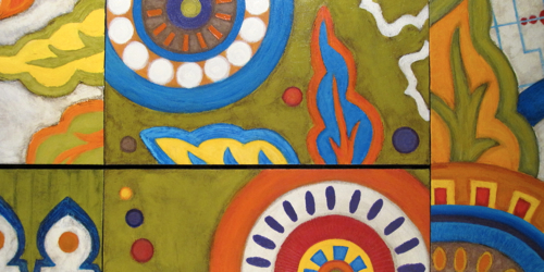
And there we have it, the finished set of five fully customized paintings:

‘Equanimity’ | 24″x18″ each | acrylic on canvas
I would love to post detail shots here as well, but since this is quite a lengthy post already to squeeze in all the juicy details and steps of how this custom set came to be, I’ve set up a facebook photo album featuring detail shots of the ‘Equanimity’ set (so close ups to show the different textures/layers) if you’d like to check it out HERE.
Thanks so much for reading!!! Take care
If you would like more information on Custom Art commissions, feel free to email me or fill out my contact form from my website.

